Ranged Panel
Overview
Component Name: gpii.firstDiscovery.panel.ranged
File: panels.js
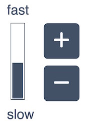
The ranged panel component provides a means to create panels that adjust a value by clicking DOM elements such as buttons, as well as showing the adjusted value in a meter. The ranged panel component is not intended to be used on its own, but provided as a base grade to another component that will use its capabilities for creating such panels. A UI example of one of these panels:
Using the Ranged Panel grade
To use the Ranged Panel grade, supply it as a gradeNames option in your component definition:
fluid.defaults("my.component", {
    gradeNames: ["gpii.firstDiscovery.panel.ranged"],
    ...
});
Grades
This component uses the following base grades:
Model
This component supports the following model properties:
| Path | Description | Values | Default |
|---|---|---|---|
value |
The selected value of the ranged component | Number | undefined |
Methods
| Method | Description | Parameters |
|---|---|---|
stepUp |
Increases the model value by the step provided in component options |
none |
stepDown |
Decreases the model value by the step provided in component options |
none |
updateMeter |
Updates the meter DOM element to show the current model value |
none |
Options
This component can be configured using the following options:
| Name | Description | Values | Default |
|---|---|---|---|
range |
An object that contains two elements: "min" and "max". They determine the minimum and maximum values of the range. | Object; "min" and "max" values are numbers. |
|
step |
Determines the size or amount of each interval or step the slider takes between the min and max. | Number |
|
selectors |
Javascript object containing selectors for various fragments of the markup, including the containers for the subcomponents. | See Selectors below |
Selectors
One of the options that can be provided to Infusion components is a set of CSS-based selectors identifying where in the DOM different elements can be found. Components use a DOM Binder to access the named elements.
The value for the selectors option is itself a Javascript object containing name/value pairs:
selectors: {
    selector1Name: "selector 1 string",
    selector2Name: "selector 2 string",
      ...
}
| Selector Name | Description | Default |
|---|---|---|
rangeInstructions |
The panel instruction. | ".gpiic-fd-range-disabledMsg" |
controls |
The wrapper container for all control items listed below | ".gpiic-fd-range-controls" |
meter |
The meter that shows the selected value | ".gpiic-fd-range-indicator" |
max |
The container to display the label for the maximum value, such as "fast" | ".gpiic-fd-range-max" |
min |
The container to display the label for the minimum value, such as "slow" | ".gpiic-fd-range-min" |
increase |
The DOM element that triggers the increase of the selected value by clicking it | ".gpiic-fd-range-increase" |
decrease |
The DOM element that triggers the decrease of the selected value by clicking it | ".gpiic-fd-range-decrease" |
Dependencies
<script type="text/javascript" src="src/lib/infusion/infusion-custom.js"></script>
<script type="text/javascript" src="src/js/msgLookup.js"></script>
<script type="text/javascript" src="src/js/tooltip.js"></script>
<script type="text/javascript" src="src/js/panels.js"></script>