Yes/No
Overview
Component Name: gpii.firstDiscovery.panel.yesNo
File: panels.js
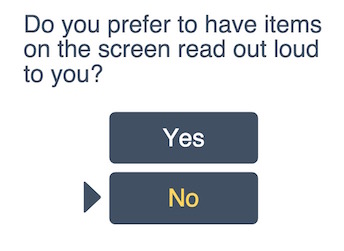
Provides a means to create panels that select and only select one of two choices, such as yes or no. This component is not intended to be used on its own, but provided as a base grade to another component that will use its capabilities for creating such panels. An UI example of one of these panels:
Using the Yes/No grade
To use the Yes/No grade, supply it as a gradeNames option in your component definition:
fluid.defaults("my.component", {
    gradeNames: ["gpii.firstDiscovery.panel.yesNo"],
    ...
});
Grades
This component uses the following base grades:
Model
This component supports the following model properties:
| Path | Description | Values | Default |
|---|---|---|---|
value |
The corresponding boolean value of the selected choice. true when the selected choice is yes; false when the selected choice is no. |
Boolean | undefined |
choice |
The selected choice. | String | undefined |
Options
This component can be configured using the following options:
| Name | Description | Values | Default |
|---|---|---|---|
controlValues |
An object that contains a "choice" element that determines choice values assigned to HTML radio buttons. | Object; "choice" value is an array with two elements. |
|
selectors |
Javascript object containing selectors for various fragments of the markup, including the containers for the subcomponents. | See Selectors below |
Selectors
One of the options that can be provided to Infusion components is a set of CSS-based selectors identifying where in the DOM different elements can be found. Components use a DOM Binder to access the named elements.
The value for the selectors option is itself a Javascript object containing name/value pairs:
selectors: {
    selector1Name: "selector 1 string",
    selector2Name: "selector 2 string",
      ...
}
| Selector Name | Description | Default |
|---|---|---|
choiceRow |
The row of each choice. It often contains choiceLabel and choiceInput. |
".gpiic-fd-yesNo-choiceRow" |
choiceLabel |
The label for each choice button | ".gpiic-fd-yesNo-choiceLabel" |
choiceInput |
The <input> tag for each choice button |
".gpiic-fd-yesNo-choiceInput" |
instructions |
The container to display the panel instruction. | ".gpiic-fd-yesNo-instructions" |
Dependencies
<script type="text/javascript" src="src/lib/infusion/infusion-custom.js"></script>
<script type="text/javascript" src="src/js/msgLookup.js"></script>
<script type="text/javascript" src="src/js/tooltip.js"></script>
<script type="text/javascript" src="src/js/panels.js"></script>